Dashboards in Audience Insights can be customized to better reflect the needs of your team or analysis goals. Whether you're adjusting visual elements, applying filters, or adding new data sources, editing a dashboard gives you control over how insights are structured and presented.
Editing an Existing Dashboard
To edit a published dashboard, start by creating your own copy:
-
Open the dashboard you want to edit.
-
Click Save As to open the Save a Copy modal.
-
Enter a name for your new version and save it to My Documents.
-
The copied dashboard will automatically open in edit mode, allowing you to make changes.
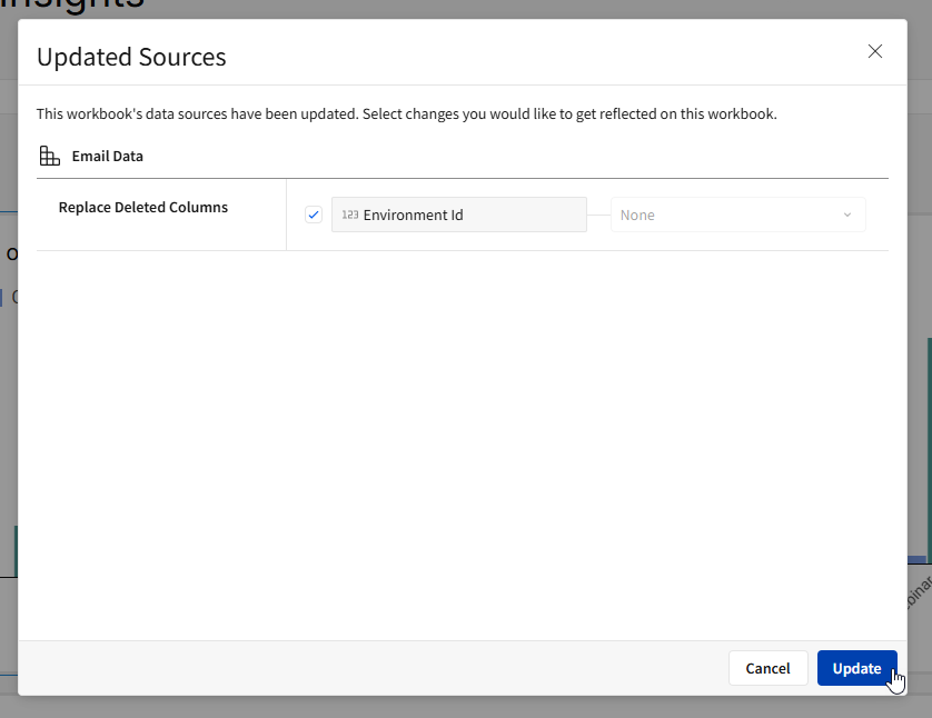
If the underlying data model has changed since the dashboard was last saved, you'll see a prompt asking whether you want to update the dashboard to reflect the latest changes. You can choose to apply these updates or continue with the current version.
Creating a New Dashboard
To create a new dashboard:
-
Click Create New from the left-hand menu.
-
Enter a name for your dashboard.
-
Your new dashboard will open in a blank state, ready for editing.
You can build your dashboard using elements from multiple data sources. You're not limited to a single source per dashboard or per page—new sources can be added at any time.
Adding Data Elements
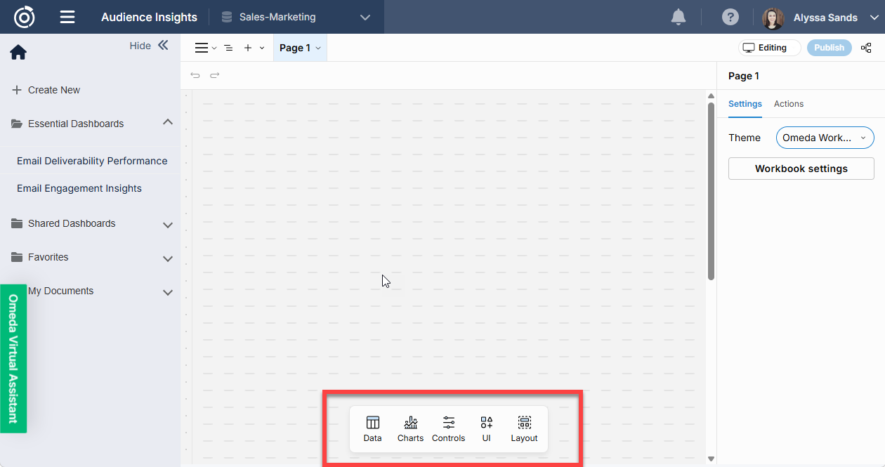
To add a data element to your dashboard:
-
Use the Add element bar at the bottom of the page.
-
To add a table or pivot table, click Data and choose the desired element.
-
To add a chart, click Charts, then select a chart type such as bar, line, or pie.
As you build, you can mix and match visual elements to reflect the analysis needs of your team or project.
Data
Tables
Tables are the most direct way to interact with your data. If you're familiar with spreadsheets, you'll find tables intuitive—though in Audience Insights, data is managed at the column level, not at the individual cell level.
To add a table to your dashboard:
-
Click the Add Element bar at the bottom of the page.
-
Select Data, then choose Table
Add a Calculated Column
You can add custom formulas directly within tables to create calculated fields.
-
Select the table, then go to the Columns list in the editor panel.
-
Next to Columns, click Add Column...
-
Choose Add New Column to launch the formula bar.
-
Enter your formula. Suggested functions and column names will auto-complete as you type.
-
Press Enter or click the checkmark to apply the formula.
-
(Optional) Double-click the column name or use the column menu to rename it.
Group Columns
Grouping allows you to summarize rows that share the same value in a given column.
-
Select the table and locate the Groupings list in the editor panel.
-
Click Add Grouping... and select the column to group by.
-
Grouped rows will enable you to apply aggregate calculations such as sums, averages, or counts.
Pivot Tables
Pivot tables help you organize and summarize your data in two dimensions, perfect for comparing grouped metrics across categories.
After adding a pivot table to your dashboard, configure it using the Element Properties tab:
-
Pivot Rows: Select one or more columns to use as row headers (e.g., Product Type).
Pivot Columns (optional): Choose columns to further break down your row values
Values: Pick the column(s) to aggregate. These are summarized automatically, and you can customize the aggregation method if needed.
Pivot tables won't display data until you define at least the Pivot Rows and Values.
Charts
Charts and visualizations provide visual context to your data, making it easier to analyze trends, compare performance, and communicate insights. Audience Insights supports a wide range of chart types to suit different analytical needs, including:
-
Bar Chart – Compare values across categories Learn more
-
Line Chart – Track trends over time Learn more
-
KPI Chart – Highlight key performance indicators Learn more
-
Area Chart – Show cumulative trends with filled lines Learn more
-
Scatter Plot – Explore relationships between variables Learn more
-
Combo Chart – Combine bar and line charts for dual-axis comparisons Learn more
-
Box Chart – Visualize data distributions and outliers Learn more
-
Pie & Donut Charts – Display proportions as slices of a whole Learn more
-
Sankey Diagram – Visualize flow and path relationships Learn more
-
Funnel Chart – Track conversion steps or process stages Learn more
-
Gauge Chart – Monitor progress toward a goal Learn more
-
Waterfall Chart – Show cumulative changes in a value Learn more
-
Region Map – Display data aggregated by geographic region Learn more
-
Point Map – Plot individual data points by location Learn more
-
Geography Map – Visualize audience metrics across geographic areas Learn more
Each chart type offers a different lens into your data, helping you tailor dashboards to your specific objectives.
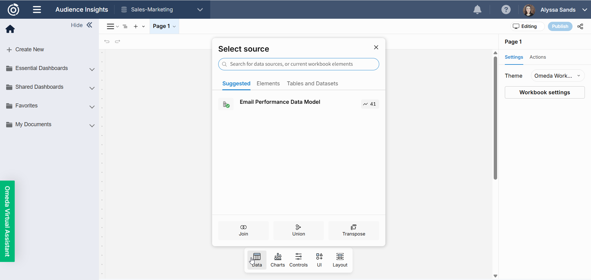
When a chart is added to the dashboard, the first thing you’ll need to choose is a data source.
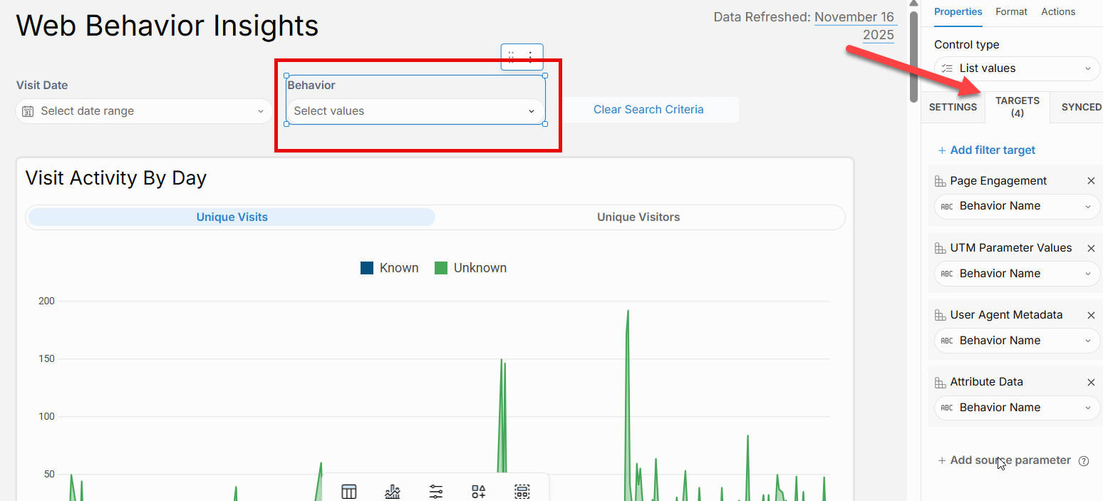
Controls
Controls allow users to filter data across one or more elements within a dashboard. They make dashboards interactive and customizable by narrowing results based on user input. Audience Insights supports a variety of control types:
-
List Values – Choose from a predefined list of options.
-
Text Input – Enter freeform text; operators may be available for advanced filtering.
-
Text Area – Supports partial or full-text matching, and can be used as a parameter in formulas.
-
Segmented Control – Display a limited set of single-select options for quick selection.
-
Number Input – Enter a single number to filter or use as a parameter.
-
Number Range – Set minimum and/or maximum values to define a Number range.
-
Slider – Select a single value from a defined range using a slider interface.
-
Range Slider – Choose a minimum and maximum value using a dual-handle slider.
-
Date – Pick a specific date (fixed or relative) to filter data or drive parameters.
-
Date Range – Filter by a range of dates, with support for both fixed and relative values.
-
Top N – Limit results to the top or bottom ranked items (e.g., top 10, bottom 5%).
-
Drill Down – Enable users to click into a more granular level of data.
-
Switch – Toggle between True/False or On/Off states.
-
Checkbox – Represent binary selections, such as include/exclude or enabled/disabled.
-
Legend – Display a legend for chart data; can also be interactive for filtering.
These controls help tailor the dashboard experience, making it easier to surface the right data for analysis or action.
After adding a control, in the panel on the right hand side, in the Target section, you can select the elements or data models that the control will filter.
UI Components
UI components help enhance the structure, interactivity, and presentation of your Audience Insights dashboards. You can use the following elements to guide users, add context, or trigger actions:
-
Text – Add titles, captions, or annotations to your pages. Customize size, style, and font, and include dynamic content using formulas.
-
Image – Insert images by uploading a file or referencing a URL. You can control how the image fits within its container and apply custom styling.
-
Button – Add a button to trigger specific actions such as navigating to another page, refreshing elements, exporting data, or modifying filters. Display text and style are fully configurable.
-
Divider – Use a horizontal line to visually separate sections or group related elements.
-
Embed – Embed external web content, videos, or tools using an iframe-enabled URL to display interactive content directly in the dashboard.
These components give you control over layout, clarity, and workflow within your dashboards.
Layout Components
Containers
Use containers to organize and visually group elements on your workbook page. Containers make it easier to manage layout, apply consistent styling, and move related elements together—helping you build cleaner, more structured dashboards.
Modals
Modals provide a focused, overlay-style view that streamlines the user experience. When opened, a modal obscures the main workbook page, allowing you to:
-
Display custom drilldowns
-
Present form fields or input controls
-
House filters or settings in a clean, dedicated space
This helps reduce visual clutter and creates a more app-like, interactive experience within your dashboards.
Data Sources
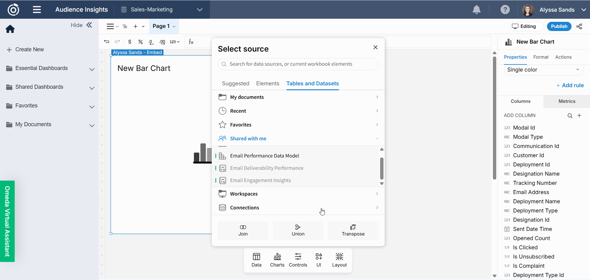
When an element is added to a dashboard, you can select the data source you’d like to use to populate that element. You can choose from suggested data sources, select Elements to use another element on the page as your source, or choose Tables and Datasets, then Shared with me to use the Omeda provided data models.
Enabling Send to Audience Builder
To allow a dashboard element to trigger a Send to Audience Builder action:
-
Select the Chart Element
Click the chart you want to enable. This opens the Customize Element panel on the right side of the dashboard. -
Add to the Custom Context Menu
-
Go to the Format tab.
-
Scroll to Custom Context Menu and click Add Option.
-
Name the new option Send to Audience Builder.
-
-
Set Up the Action Sequence
-
Switch to the Actions tab.
-
Click Add Action Sequence.
-
Set Trigger to Chart Content Menu and choose the newly created Send to Audience Builder option.
-
-
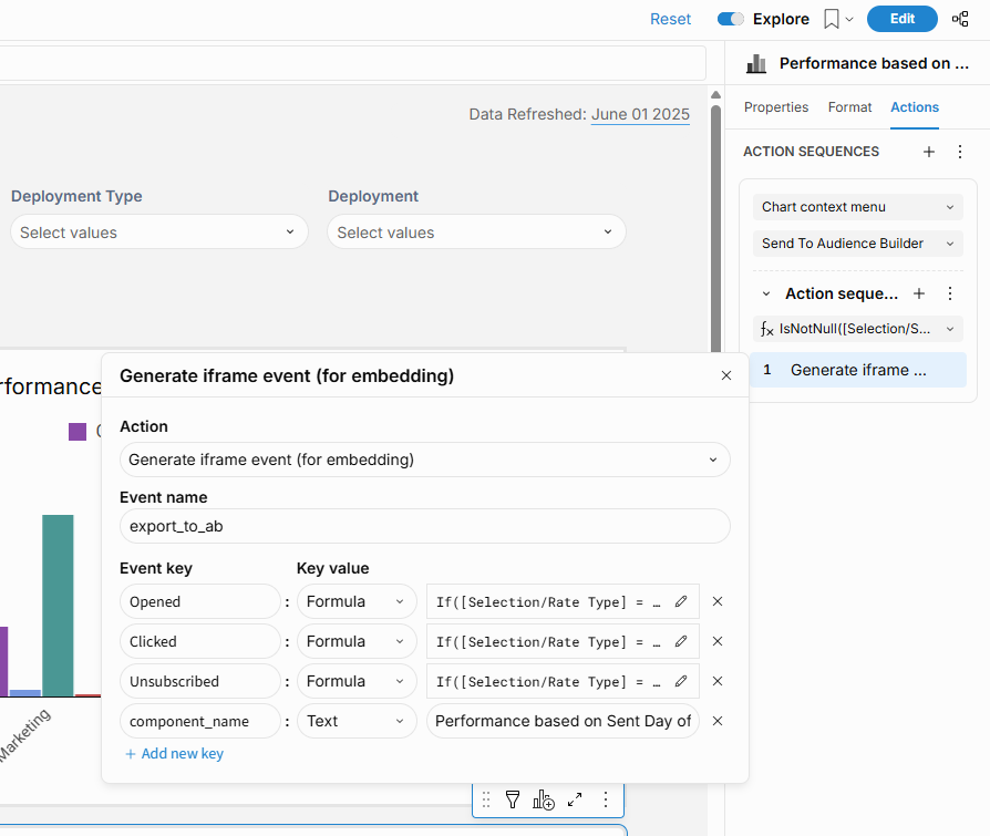
Configure the Action
-
For the action type, select Generate iframe event (for embedding).
-
Enter the event name as:
export_to_ab.
-
-
Add Event Keys (Optional but recommended)
To pass context into Audience Builder, add event keys that describe the selected audience:-
component_name: Name of the chart (e.g., “Top Performers”) -
Opened: e.g.,1 -
Clicked: e.g.,1 -
Unsubscribed: e.g.,0
-
Publishing your Dashboard
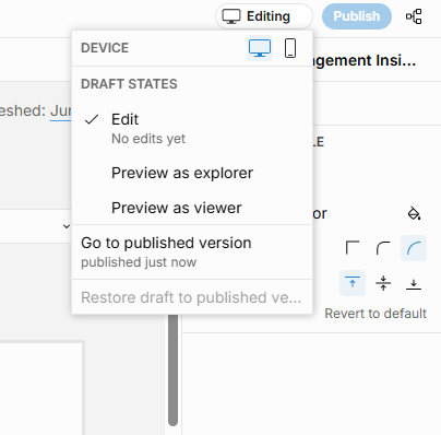
When you're finished making changes to your dashboard, click Publish in the top-right corner to save your updates. Then, switch to Editor Mode and select Go to Published Version to view the live version of your dashboard.
Sharing your Dashboard
To share your dashboard, click the menu icon next to the dashboard name in the left-hand sidebar, then select Share. A modal will appear where you can search for and select the team member(s) you'd like to share the dashboard with.
Additional Resources
-
View Dashboards Documentations
Learn how to access, navigate, and interpret dashboards in Audience Insights. -
Review Our Data Models
Get familiar with the data structure behind your dashboards, including entities like Email, CDP, and Subscriptions. -
Explore Training and Documentation from Sigma
Dive deeper into advanced features and capabilities with our analytics engine partner, Sigma Computing. -
Audience Insights Overview
Understand how Audience Insights fits into the broader Omeda platform and what makes it different.
Table of Contents