Viewing a Dashboard
Audience Insights dashboards are designed to help you monitor audience behavior, evaluate content performance, and take action. Here’s what you can do when viewing a dashboard:
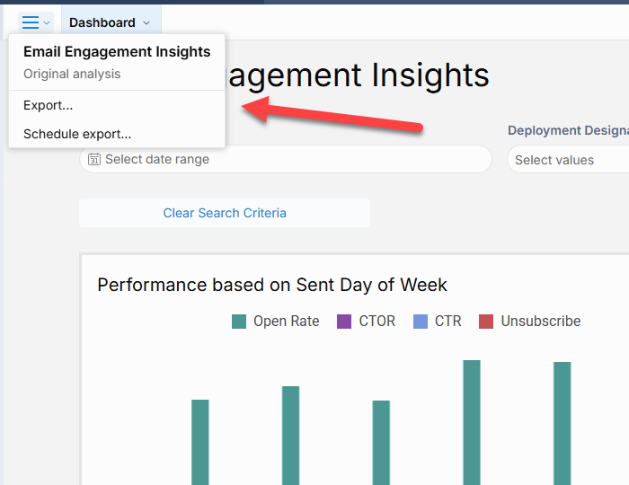
Exporting Dashboards & Elements
Export functionality can be accessed from several locations:
-
The menu in the top-left corner of the dashboard (for full dashboard exports)
-
The menu to the right of a dashboard page name
-
The ellipsis menu on the top-right of individual dashboard elements (for element-level exports)
Exporting the Full Dashboard
Dashboards can be exported in PDF, PNG, or Excel format. Use the top-left menu to:
-
Download the export directly via your browser
-
Send the export to one or more recipients via email
Exporting Individual Dashboard Elements
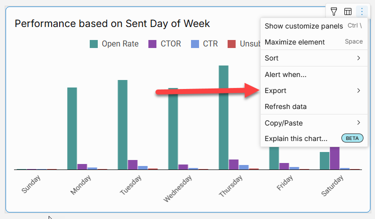
Each dashboard element (such as a chart or table) includes a quick export option. This allows you to export that specific component's data in the following formats:
CSV, Excel, JSON, PNG, or PDF.
You can also choose to export the underlying data for more detailed analysis.
For additional options, select Export to open the Export modal. From here, you can:
-
Send the export to specified email addresses. The size limit for emailed exports is 30MB
-
Include multiple dashboard elements in a single export or choose to export multiple pages within the dashboard
-
Package the export as a .zip file for easy sharing
Schedule Exports
Scheduled exports can be configured from two places:
-
The dashboard-level menu (top-left corner)
-
The ellipsis menu on individual dashboard elements
Using the Schedule Export Modal
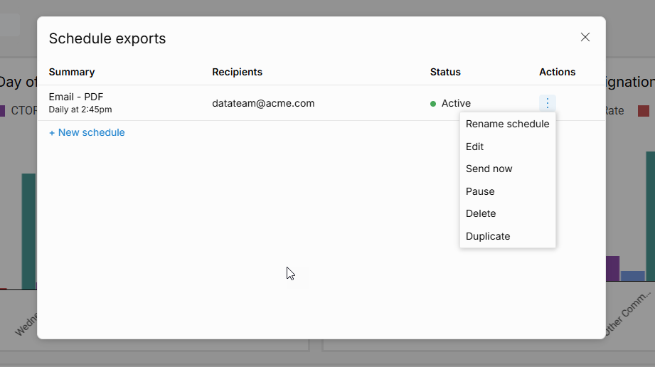
The Schedule Export modal allows you to manage all scheduled exports associated with the dashboard or any of its elements. Within this modal, you can:
-
Create new scheduled exports
-
Rename, edit, pause, duplicate, or delete existing exports
-
Trigger a scheduled export manually
Frequency & Conditions
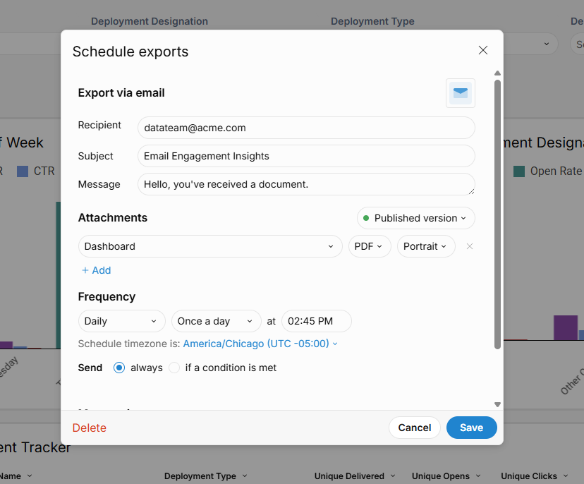
Exports can be scheduled to run at a variety of intervals:
-
Daily
-
Weekly
-
Monthly
-
Custom frequencies
You can also define conditional logic to send the export only when specific criteria in the data are met, helping reduce noise and focus attention where it's needed.
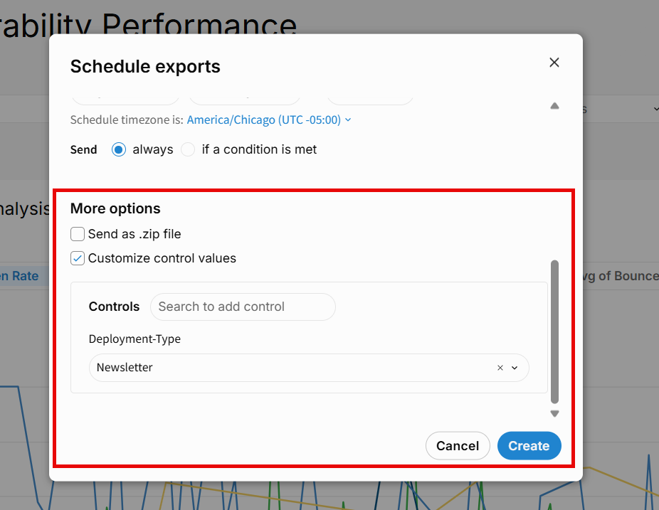
Custom Filter Values
Use the Customize Control Values option to set specific filter values—such as Deployment Types or date range—that should be applied to the export. This ensures recipients receive relevant and consistent data each time the export runs.
Alerts
You can configure a scheduled export to run only when specific conditions are met, allowing you to use exports as conditional alerts. This is useful for monitoring changes, anomalies, or data availability—ensuring you only receive updates when they matter.
How Conditional Exports Work
When a scheduled export is due, it will evaluates the data in your selected element:
-
If the defined condition is met, the export proceeds.
-
If the condition is not met, the export is skipped.
This combination of a recurring schedule and a relevance check ensures that alerts are both timely and meaningful.
Setting an Alert
An Alert can be set via the Export modal, in the Frequency section, under Send, by selecting If a condition is met or by selecting “Alert when…” on a dashboard element.
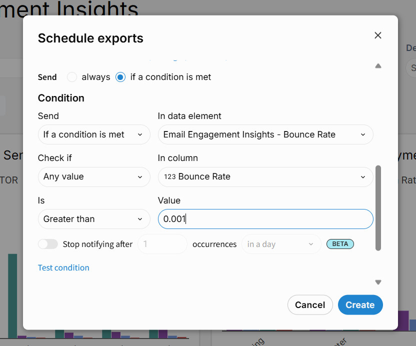
Defining the Condition
In the Condition section, specify the following:
-
Send criteria:
-
If there’s no data: Export only when the selected element has no data
-
If there’s data: Export only when data is present in the selected element
-
-
Target element:
-
Select the visual element or table this condition applies to (via In data element)
-
-
Condition type:
-
Any value: Trigger if any value in the specified column meets the condition
-
All values: Trigger only if all values meet the condition
-
If the selected element is a KPI, additional condition types become available:
-
Element value: Trigger if one or more values in the KPI’s Value property meet the condition
-
Comparison value (%): Trigger if values in the KPI’s Comparison property meet the condition
-
Column and logic:
-
Choose the relevant column (for tables)
-
Define the condition using the Is operator (e.g., greater than, equals)
-
Set the comparison value
-
Click Test condition to validate your setup
-
Monitoring Anomalies with Formulas
You can also use conditional exports to monitor for outliers or anomalies, either:
-
By defining static thresholds (e.g., traffic > 100,000)
-
Or by writing custom formulas to detect anomalies based on dynamic criteria
For example, if you're tracking unusual spikes in web traffic, you could:
-
Create a formula that flags anomalies in page visit data
-
Schedule a conditional export that triggers when this formula output indicates an anomaly
-
Configure the export to send an email when triggered
The system will pre-populate a default conditional statement based on the selected target element, and automatically use the element’s title as the subject line for the alert email—making it easy to identify the context of each notification.
Explain this chart
The Explain this chart feature uses AI to instantly generate a natural-language summary of any chart. These explanations highlight key insights, trends, and patterns—providing helpful context to better understand your data and support informed decision-making. You can click Copy text to save or share the summary, such as pasting it into a text element to accompany the chart.
Using Explore Mode
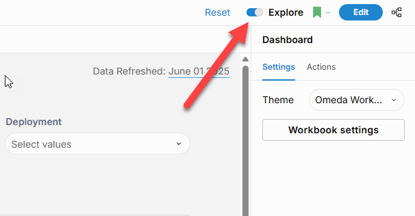
Users with Create access can enable Explore mode using the toggle in the top-right corner of the dashboard. This opens an isolated workspace where you can customize published content and perform ad hoc analysis—without affecting the original or shared version. It’s ideal for testing changes, exploring data, or building personal views.
You can also enter Explore mode by selecting Show Customize Panels from a chart’s menu. This allows you to immediately begin editing that specific chart component within the flexible Explore environment.
Using Saved Views
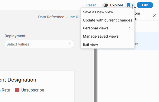
Saved views let you “bookmark” a custom state of a published workbook—making it easy to return to specific filters, controls, or visual edits later.
Creating a Saved View
-
Make any desired changes in a custom view of the dashboard.
-
Click the bookmark icon on the right side of the dashboard, then select Save as new view…
-
Enter a name for your view and save.
-
To make this your default landing view for the dashboard, select Set as default view.
-
-
Your new view will appear under Personal Views and can be accessed anytime via the bookmark icon.
To exit the saved view, open the bookmark menu and select Exit View.
Editing a Saved View
-
Open the saved view from the bookmark icon.
-
Make your updates in the dashboard.
-
From the bookmark menu, select Update with Current Changes to save your edits.
Filtering Chart Elements
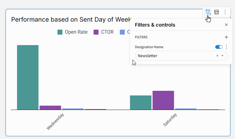
You can apply filters directly to individual chart elements to focus on specific subsets of data.
How to Add a Filter
-
Click Filters (funnel icon) in the chart element’s toolbar.
-
Select Add filter...
-
Click the + icon and choose the column you want to filter on.
Filter Types (Based on Data Type)
When you select a column, a default filter type is applied automatically depending on the column’s data type:
-
Number columns use a number range filter
-
Text or Logical columns use a list filter
-
Date columns use a date range filter
Configuring Filters
Click More next to the filter to:
-
Change the filter type
-
Adjust filter settings (e.g., match conditions, range limits)
Filters are applied automatically as soon as they are added or adjusted.
Viewing Underlying Data
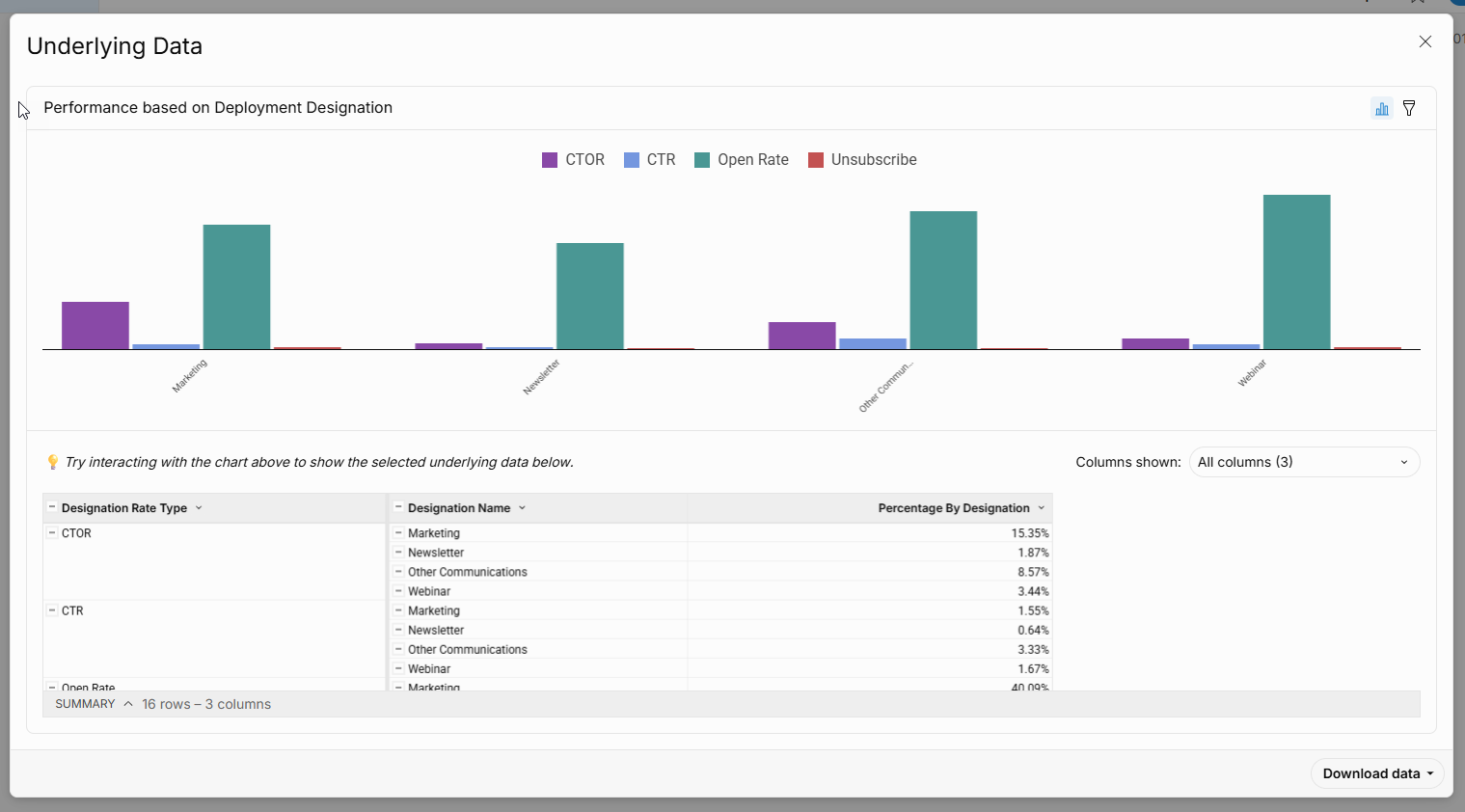
To explore the data behind a chart, select Show Underlying Data. This opens a modal displaying the related dataset in both chart and table formats.
-
You can interact with the chart to highlight specific values in the table below.
-
Use the Columns shown dropdown to choose which columns to display.
-
To keep a local copy, select Download data in your preferred format.
This feature helps you understand the full context behind visualizations, validate insights, or extract detailed metrics for further analysis.
Send to Audience Builder
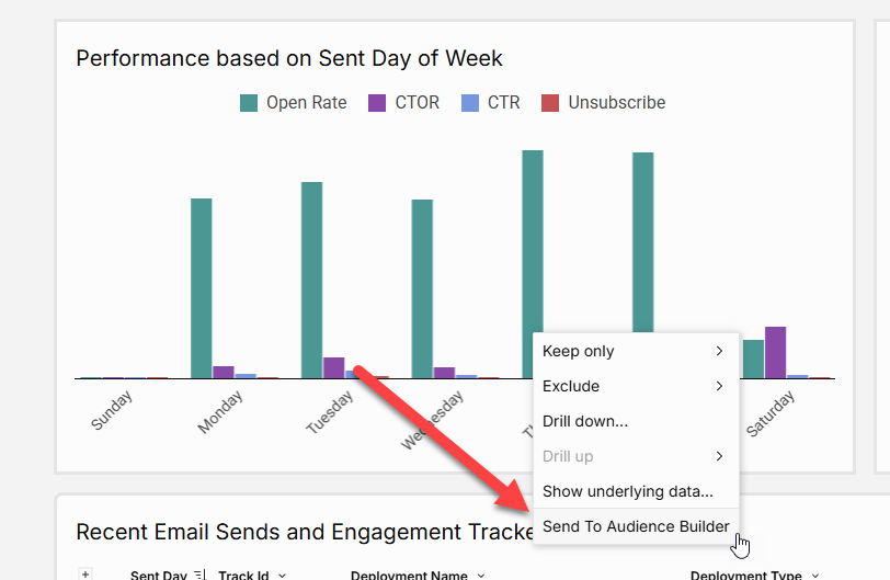
Send to Audience Builder lets you instantly activate filtered segments from your dashboards—no exports or extra tools needed. You can trigger this feature within chart elements by either clicking into a chart and selecting Send to Audience Builder from the menu, or by right-clicking and choosing the same option. The selected static audience is then sent to Audience Builder, where it can be further segmented or used to power campaigns across email, personalization, SMS, and more.
Additional Resources
-
Create and Edit a Dashboard
Learn how to build new dashboards or update existing ones using Audience Insights. -
Review Our Data Models
Get familiar with the data structure behind your dashboards, including entities like Email, CDP, and Subscriptions. -
Explore Training and Documentation from Sigma
Dive deeper into advanced features and capabilities with our analytics engine partner, Sigma Computing. -
Audience Insights Overview
Understand how Audience Insights fits into the broader Omeda platform and what makes it different.
Table of Contents